Surprises are rare at auto shows, but Hyundai pulled one over on the industry when it unveiled the 2019 Veloster N at the 2018 Detroit Auto Show.
In addition to unveiling the standard trims of its all-new 2019 Veloster, Hyundai also gave us the N, which will be the first US-market car to fall under Hyundai"s new performance brand. Overseas, it has the i30 N, which we don"t get in the US. This will be the first of what I hope will be several new performance-oriented Hyundais to land on our shores.
Under the hood is a 2.0-liter, direct-injected, turbocharged I4. It puts out up to 275 horsepower and 260 pound-feet of torque, all of which is routed to the front wheels through a six-speed manual transmission. If you can"t heel-toe downshift, worry not, because the transmission will match revs for you. Its sport exhaust will also crackle and burp ("overrun," if you"re down with the lingo) during spirited driving and the aforementioned downshifts.
Hyundai gave the Veloster N a few key visual updates to help set it apart from the rest of the lineup. Outside, there are exclusive front and rear bumpers, a new grille with actual functional brake ducts, a larger rear spoiler and a dual-tip exhaust. Inside, N-specific bits include the cloth front seats, the steering wheel, shift knob and instrument cluster. There"s also a sequential shift indicator on the dashboard to ensure you don"t bang against the rev limiter.
Under that skin, the car is essentially way more rigid to help handle all the forces at play during spirited driving. There"s a multi-mode suspension with a track-specific N mode, an available limited-slip differential and a drive mode that you can customize to meet your personal needs. You can upgrade the brakes to massive 13.6-inch front and 12.4-inch rear rotors, to boot.
The 2019 Hyundai Veloster N goes on sale in the fourth quarter of 2018, and pricing has yet to be announced.
TechViral
Sunday, 25 February 2018
2019 Hyundai Veloster N brings Korean performance to the US
Toyota and Lexus vehicles will finally start getting CarPlay this year
Toyota has been a holdout from CarPlay, Apple’s in-dash infotainment system that works with your iPhone. The automaker and its luxury brand Lexus have yet to offer it in any models, despite most other car companies giving in on at least a few vehicles (which tends to later to broader rollout thereafter).
The new 2019 Toyota Avalon will have CarPlay on board, however. The vehicle was unveiled today, and Toyota confirmed that it’ll have support for Apple’s system at launch. No mention of Android Auto, unfortunately, which could mean Google mobile OS smartphone fans are still out of luck for the foreseeable future.
Toyota announced that Alexa would be coming to some of its vehicles via the Entune 3.0 (Toyota) and Enform 2.0 (Lexus) infotainment system updates, but now we know that CarPlay will also be part of the package on these stems for some vehicles going forward. It’s not yet clear how many 2019 year models will include CarPlay support, or whether this will also be coming to older vehicles that are getting the Entune 3.0 and Enform 2.0 updates.
Automakers seem to have been reluctant to allow both Android Auto and CarPlay on their platforms initially, but most are coming around – and I’m willing to bet customer feedback is a big reason why.
iPad Pro 10.5in (2017) Review: Thin, Fast and Very Expensive
As of its 5 June WWDC announcements, Apple sells four iPads in four different sizes: the iPad mini 4 (with a 7.9-inch screen), the iPad 2017 (with a 9.7-inch screen), and new iPad Pro models in 10.5-inch and 12.9-inch screen sizes.
In this article we run the rule over the new 10.5-inch model, testing its performance in speed, graphics and battery tests and reviewing its design, ease of use and tech specs. You can read more about the comparative advantages of Apple"s various tablets in our iPad buying guide 2017; the iPad Pro 10.5in, like the three other models mentioned above, is available from Apple"s website.
Design & build quality
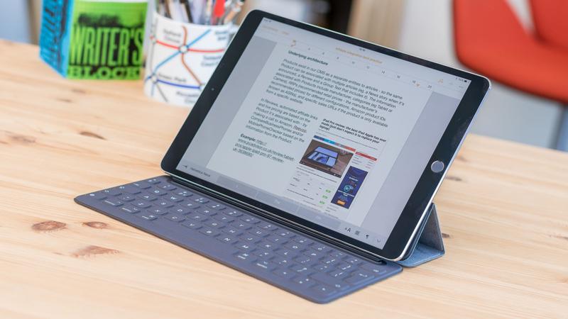
This new model of the iPad Pro comes with 10.5-inch screen - something we"ve not seen before on an iOS device. In effect, this iPad replaces the old 9.7-inch Pro model, and squeezes the larger screen into a chassis that"s not a lot bigger by making the bezels thinner.
- iPad Pro 9.7in (2016): 240 mm x 169.5 mm x 6.1 mm; 437g/444g (Wi-Fi/cellular models)
- iPad Pro 10.5in (2017): 250.6mm x 174.1mm x 6.1mm; 469g/477g (Wi-Fi/cellular models)
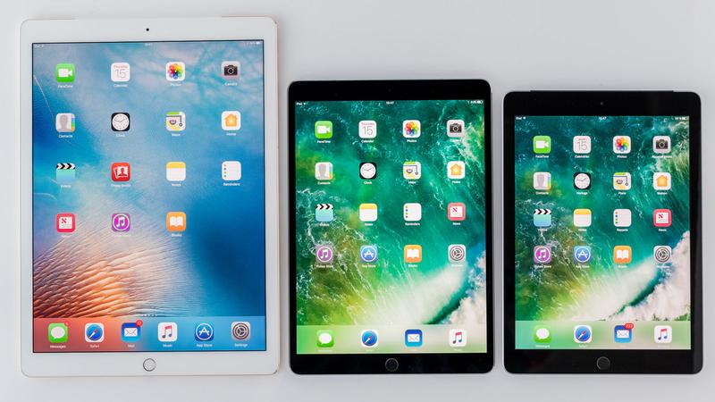
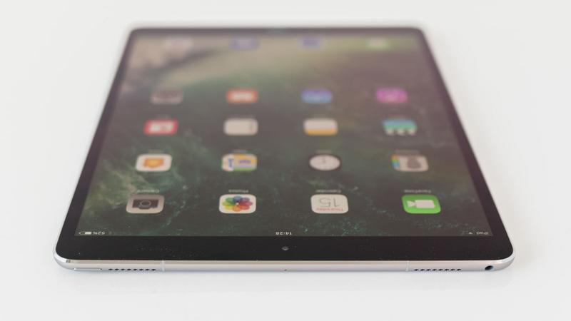
The new iPad is slightly, but noticeably, larger than previous mid-size models. From left: the iPad Pro 12.9in; the iPad Pro 10.5in (2017); and the iPad Pro 9.7in that it replaces.
It"s not a vast change - by our estimates you"re getting about 18.3 percent more screen area - but, speaking subjectively, it feels significant in use. There"s more room for everything; games are more immersive, video more cinematic. (Your reviewer does most of his gaming on a 12.9in iPad, however, so it"s possible that his perception of the 9.7in screen has been swayed by this.)
We also enjoy the slimmer-bezel look, although this remains a gradual improvement rather than the radical edge-to-edge design we"re hoping for - the fulfilment of the sheet-of-glass concept that we view as the iPad"s logical end point. Read next: iPad Pro 10.5in (2017) vs iPad Pro 12.9in (2017)
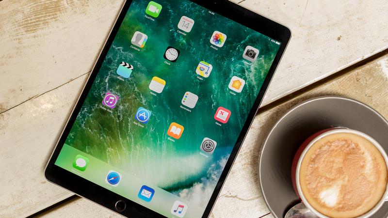
And other than the screen size and the bezel slimming that this necessitates, this remains a conservative design. Put this next to the iPad Air 1, for instance - a tablet that was launched in autumn of 2013 - and the differences are ones of scale only.
Is it unreasonable to ask for an overhaul when the existing design is a classic? (And it is - this is an elegant and beautifully engineered device.) Perhaps. But the fact that Apple has changed so little over the years, aesthetically, may explain why consumers tend to be reluctant to upgrade their iPads.
For a comparison of the new 10.5in Pro and its 9.7in predecessor, see iPad Pro 10.5in (2017) vs iPad Pro 9.7in (2016).
Colour options
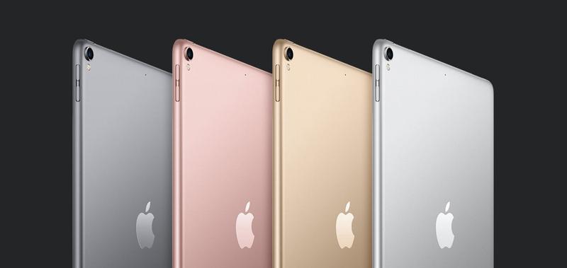
The new 10.5-inch iPad Pro gets the Rose Gold (pink) colour option that was previously limited, in iPad land, to the 9.7-inch Pro model. So that"s four choices: Space Grey, Rose Gold, gold and silver.
Tech specs
Let"s look next at the internal specs in the new iPad Pro and how they affect its performance.
Processor
As expected, the new iPad Pro 10.5 features a modified version of the A10 Fusion chip in the iPhone 7, called the A10X Fusion.
The A10X Fusion chipset has six CPU cores: three high-performance cores and three efficiency cores for improved battery life. It also features a meaty twelve-core GPU.
At launch Apple predicted 30 percent faster CPU performance than the A9X chip in the first-generation iPad Pro models, and 40 percent faster graphics performance; and our tests show that this is a seriously fast machine.
In GeekBench 4"s processing speed benchmarks, the iPad Pro 10.5in scored an impressive 3,891 in single-core, higher than any previous iPad we"ve tested by at least 800 points, and a phenomenal 9,300 in multicore. For comparison the iPad Pro 9.7in (2016) scored 5,073 in multicore, while the iPad Pro 12.9in (2015) and its 4GB of RAM averaged 5,123.
We also ran the new iPad through the JetStream JavaScript test, which gives an idea of how efficiently a device will process web applications. Again, the iPad Pro 10.5in was a powerhouse, with an unprecedented score of 205.2. The iPad record was previously held by the iPad Pro 9.7in (2016), which managed just 151.
Finally, we put that twelve-core GPU through its paces on the GFXBench Metal graphical benchmark. The iPad Pro 10.5in averaged 60.00fps (in the T-Rex onscreen component of the test), 56.54fps (Manhattan onscreen) and 42.22fps (Manhattan 3.1).
These too are class-leading numbers, particularly in the more difficult tests. The iPad Pro 9.7in scored 59.9fps (T-Rex), 37.6fps (Manhattan) and 25.4fps (Manhattan 3.1).
Remember that these scintillating test results are not necessarily representative of what you"ll experience in the real world. It"s true that we haven"t found a game that can tax the new iPad"s graphical capabilities, for example, but that"s true for last year"s Pro as well; this is a future-proofing exercise, and a green light to Apple"s app developer partners to build software that relies on more advanced hardware.
Display
As previously mentioned - and as signalled by its name - the new iPad has an entirely new display size: 10.5in, measured diagonally from corner to corner. And it has a correspondingly larger resolution, too, of 2,224 x 1,668, at Apple"s iPad-standard 264 pixels per inch; it looks as sharp as you"d expect an iPad to look and no more. Which is fine.
Apple"s next-generation iPad Pro also features an upgraded 120Hz display. (For reference, existing models of iPhone and iPad max out at 60Hz.)
The higher the refresh rate, the more frames the display can process every second: a 60Hz display can process up to 60 frames per second, while a 120Hz display can offer double the amount at 120 frames per second. It"s why some PC gamers opt for a 144Hz display.
The new iPad gets the newer True Tone display that was featured on the 9.7in Pro but was denied to the 12.9 when it launched.
True Tone is a nice feature to have, albeit not one that you"ll be conscious of until you turn it off (in a nice touch during setup, Apple asks if you want to activate the feature and shows you the screen with it on and off, so you get an idea of what it offers); to drop the pretence of scientific objectivity for a moment, it just makes the screen a bit nicer to look at. Under mixed sun and electric light during daytime conditions, for example, we"ve found that it warms up the colour palette.
A few more details: the display offers 600 nits brightness, can display HDR video, and dynamically adjusts the refresh rate depending on what you"re looking at. This could be key to preserving battery life - which we"ll be have a look at in a moment.
Cameras
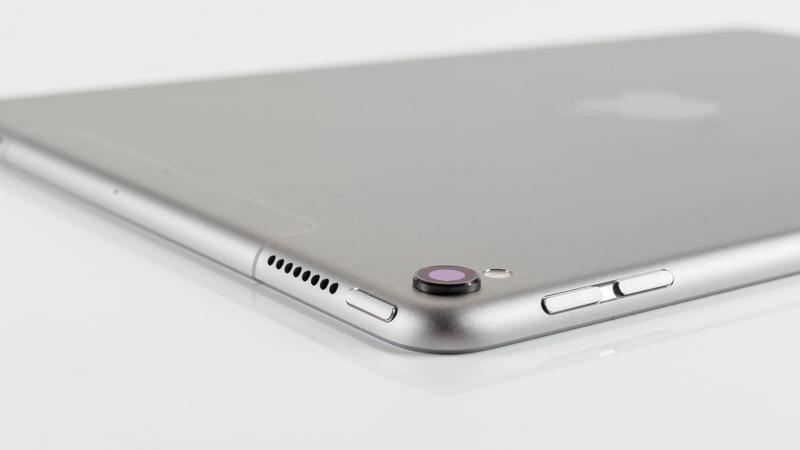
The new iPad Pro comes with a 12Mp rear-facing camera with f1.8 aperture, six-element lens and a quad-LED True Tone flash. The front-facing camera has a rating of 7Mp and the Retina Flash feature, which makes the entire screen light up to serve as a makeshift flash.
This is the same camera setup as the iPhone 7; it"s a bit better than the 9.7-inch iPad Pro (12Mp and 5Mp respectively) and a lot better than the old 12.9-inch Pro (8Mp and 1.2Mp, and no flash).
Storage capacity
Apple has bumped the storage options again.
The new iPad Pro models start at 64GB as a baseline, with options to get 256GB or a mighty 512GB. That"s the most storage offered with any iOS device to date and far more than we can imagine anyone needing. Then again, the new Pro models are more clearly than ever marketed at creatives and design professionals, the sort of people who might just need access to a large library of RAW photos, half-edited video projects and digital illustrations on the go.
More importantly for the rest of us, this is the first time where we feel like the average, everyday user will be completely satisfied with the entry-level model of an iPad, since 64GB is a solid chunk of storage.
Touch ID
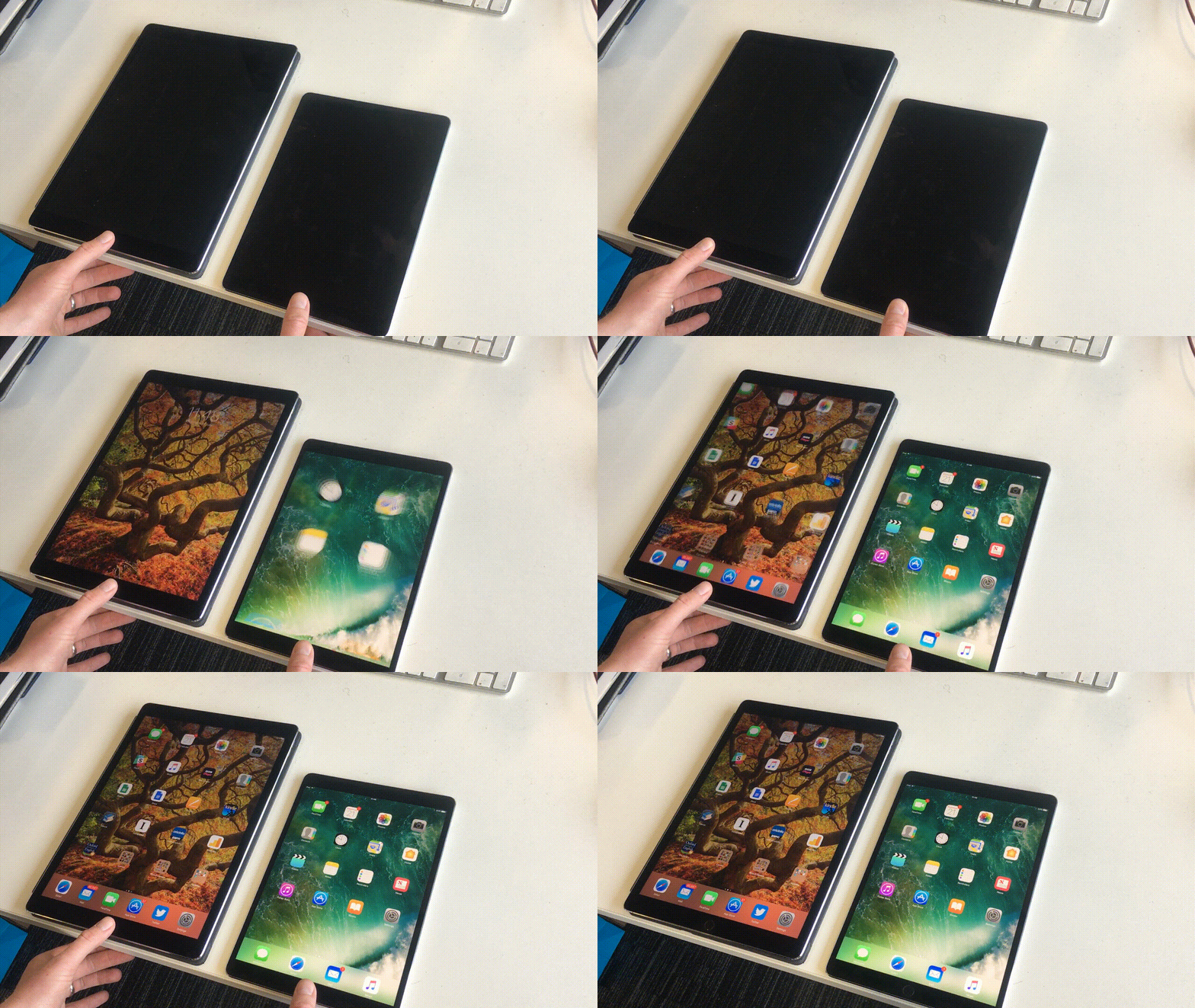
The new iPad Pro, pleasingly, gets the second-gen version of Apple"s Touch ID fingerprint scanner, rather than the first-gen version seen in previous iPads.
This has been a bit of a bugbear for us, since second-gen Touch ID has been around for a while (it first appeared in the iPhone 6s) but was ignored by the iPads that followed it - until now. Second-gen Touch ID is a shade quicker and in our experience considerably more reliable than the original version.
Read next: How to fix Touch ID
Battery life
A balance seems to have been achieved between the more powerful chipsets and more advanced displays, and the new power-saving features: Apple says the new iPad Pro models will offer the same 10-hour battery life as the last generation.
The iPad Pro 10.5in performed admirably in Geekbench 3"s battery test, albeit fractionally behind the 2015 and 2016 Pro models: it lasted very slightly under 11 hours. Battery tests are never to be relied upon entirely - conditions and factors vary in a million ways from situation to situation - but for everyday use it would be reasonable to expect longer life than this performance in a demanding test.
Launch date
The new iPad Pro was announced at WWDC 2017 on 5 June, and is available to order right now. You can buy the new iPad Pro here.
UK price
The iPad Pro very much isn"t the bargain offering we got earlier this year in the form of the iPad 2017, which starts at a highly tempting £339.
We reckoned this one would start at around £570 to £600, but the entry level is actually £619. Ouch. Just remember that this entry-level model comes with a very decent 64GB of storage. Read next: Best cheap iPad deals
- iPad Pro 10.5 (64GB, Wi-Fi): £619
- iPad Pro 10.5 (256GB, Wi-Fi): £709
- iPad Pro 10.5 (512GB, Wi-Fi): £889
- iPad Pro 10.5 (64GB, cellular): £749
- iPad Pro 10.5 (256GB, cellular): £839
- iPad Pro 10.5 (512GB, cellular): £1,019
You can buy the new iPad Pro here.
For comparison (and bear in mind that this was a year-old product), here"s how the 9.7-inch Pro was priced before WWDC:
- iPad Pro 9.7 (32GB, Wi-Fi): £549
- iPad Pro 9.7 (128GB, Wi-Fi): £639
- iPad Pro 9.7 (256GB, Wi-Fi): £729
- iPad Pro 9.7 (32GB, cellular): £669
- iPad Pro 9.7 (128GB, cellular): £759
- iPad Pro 9.7 (256GB, cellular): £849
...and the 12.9inch model from 2015, again before WWDC:
- iPad Pro 12.9 (32GB, Wi-Fi): £729
- iPad Pro 12.9 (128GB, Wi-Fi): £819
- iPad Pro 12.9 (256GB, Wi-Fi): £909
- iPad Pro 12.9 (128GB, cellular): £939
- iPad Pro 12.9 (256GB, cellular): £1,029
Podcast: All the announcements at WWDC 2017
The UK Tech Weekly Podcast team dissect the latest announcements in episode 64, including our thoughts on the new iPads.
Thursday, 22 February 2018
Facebook confirms test of a downvote button for flagging comments
How can Facebook promote meaningful interaction between users? By making them downvote inappropriate comments to hide them. Facebook is now researching a downvote button on a limited set of public Page post comment reels, the company confirms. But what Facebook does with signals about questionable notes could grow new the issue of censorship, and its role as a news editor and media company.
A Facebook spokesperson tells that the motivation behind the downvote button is to create a lightweight channel for parties to render a signal to Facebook that specific comments is inappropriate, uncivil, or misleading.
Here’s the statement Facebook catered: “We are not experimenting a dislike button. We are examining a feature for beings to pay us feedback about notes on public sheet poles. This is running for a small set of people in the U.S. only.”
This is what the downvote button looks like up close :P TAGEND![]()
When sounded, the downvote button conceals a comment, and causes customers added reporting options like “Offensive”, “Misleading”, and “Off Topic”. Those were gonna help Facebook figure out if the comment is abhorrent, a species of “fake news”, or precisely insignificant. Facebook already has a “Hide” button for remarks, but it’s generally concealed behind the drop-down arrow on remarks rather than immediately clickable.
Here you can see the downvote button on specific comments yarn, plus what happens when you click it. The screenshots come from Christina Hudler .
According to Facebook, this is a short-term assessment that doesn’t change the rank of specific comments, pole, or Page. It’s designed as a route to give feedback to Facebook , not the commenter, and there will be no publicly conspicuous count of how many downvotes a comment gets. The assessment is feed for 5% of Android consumers in the U.S. with communication set to English. The downvote button only appears on public Page uprights , not on berths by Groups, public figures or customers. There’s currently no plan to expand the test as is.
Not A Dislike Button
A dislike button have so far been the most sought Facebook feature, but Facebook "ve never" given in.
Back in 2015, CEO Mark Zuckerberg responded to a Q& A interrogate about it, saying :P TAGEND
“We didn’t want to merely build a Dislike button because we don’t want to turn Facebook into a forum where people are electing up or down on people’s poles. That doesn’t seem like the various kinds of parish we want to create.”
Instead, Facebook improved the Reactions alternatives that let you respond to posts and comments with adoration, wow, haha, unfortunate or annoyed emoji. Facebook too improved actions into Messenger with the option to give messages a thumbs-up or thumbs-down so you could demonstrate arrangement or disagreement.
But the new downvote button is the closest Facebook has come to actually leaving parties a dislike button. Downvoting was popularise on Reddit for crowdsourcedcomment ranking. Reddit co-founder Alexi Ohanian weighed in on Facebook’s version via Twitter :P TAGEND
https://twitter.com/alexisohanian/status/961722334192300035?ref_src=twsrc%5Etfw
The downvote button ties in with Facebook’s recent push to enhance its users’ well-being by prioritizing News Feed content that drives meaningful interactions instead of passive, zombie browsing. That preceded Facebook to show fewer viral videos, which in turn contributed to a 700,000 consumer decrease in U.S. and Canada daily active customers -- its firstly lessen ever anywhere -- and Facebook’s slowest DAU growth rate it’s ever reported.
But one highway Facebook could make more meaningful interaction without misplacing season on site could be by ensuring the most interesting observes are at the top of posts. Facebook once ranks mentions by relevancy based on Likes and answers. But the downvote button could ensure that if abhorrent comments rise up and stall deliberation, Facebook will know.
That going to be able to lead to a channel for Facebook to inter these comments, or the people that post them. Nonetheless, this will exclusively open up more questions about censoring and what prepares as inappropriate at a time when Facebook is already struggling to manage its responsibilities as what Zuckerberg announces “not a usual media company.”
Tuesday, 20 February 2018
Microsoft Build will run from May 7 to 9 in Seattle, will overlap with Google I/O
Scheduling tech meetings is hard-boiled, particularly in May, when seemingly every company wants to hold a major event, including Google and Microsoft. Often, Google I/ O and Microsoft Build, the flagship developer meets for both companies, happen within a few weeks or two of each other in May. But not this year.
Microsoft today announced that its Build discussion in Seattle will run from May 7 to 9. Google I/ O is scheduled to run from May 8 to May 10. That’s not ideal.
https://twitter.com/Microsoft/status/961648223067582465?ref_src=twsrc%5Etfw
Google perhaps introduced Microsoft in a tough smudge given that it announced its appointments firstly. Both corporations use these events to perform major proclamations that affect both their respective make communities and their consumers. Last-place time, for example, Microsoft expended Build to announce both brand-new developer and shadow implements, as well as the most recent version of Windows 10.
By planning Build right before I/ O, Microsoft clearly hopes to steal some bellow from Google.
Most attendees maybe merely attend one of these indicates, so that shouldn’t be an issue for most. Microsoft normally plans two days of keynotes for Build, though, so May 8 will be an interesting day for the tech press if both Google and Microsoft prop dueling themes on that day.
Registration for Build will open on February 15. Developers who want to be in the running for air tickets for Google I/ O is also necessary to framed their hat in the ring between February 22 and 27.
Monday, 19 February 2018
WhatsApp officially launches its app for businesses in select markets
WhatsApp today officially launched its new WhatsApp Business app in adopt marketplaces, including Indonesia, Italy, Mexico, the U.K. and the U.S ., ahead of its planned worldwide rollout. The add-on of business profiles and new messaging implements aimed at business customers is part of the company’s broader plan to generate revenue by accusing large firms for advanced tools to communicate with customers on the pulpit now used by over a million people worldwide.
The WhatsApp Business app is the initial enter spot in this market.
Aimed at smaller businesses, the free app- Android-only for now- facilitate corporations better connect with their customers and establish an official vicinity on WhatsApp’s service. Essentially, it’s the WhatsApp version of a Facebook Page.
The company had previously announced the app’s entrance, and inaugurated verifying business notes as part of its WhatsApp Business pilot program back in September 2017. Verified accounts were given a dark-green checkmark as a means of illustrating their authenticity.
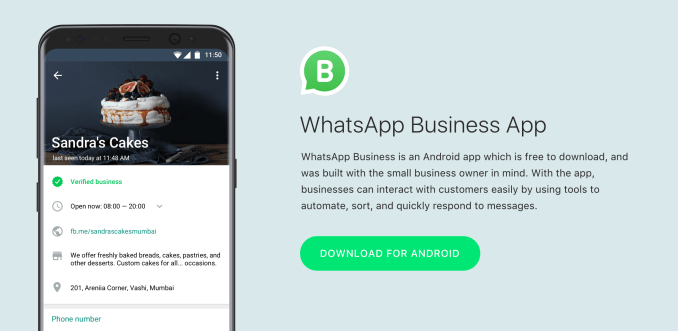
With the brand-new WhatsApp Business app arriving today, small companies can set up their WhatsApp Business sketches by crowding out info like a business description, email, address and website.
WhatsApp says people will know when they’re talking about here a business because these reports will be listed as “Business Accounts.” Over time, some of these will become “Confirmed Accounts, ” after WhatsApp substantiates the accounting phone number it registered with matches the business phone number.
Once established on the WhatsApp network, businesses can then utilize a series of implements provided by the app, like smart messaging tools that offer similar technology as what you’d find today in Facebook Messenger.
 For example, the app offers “quick replies” that afford tight their responses to customers’ frequently asked questions; “greeting messages” that inserts customers to the business; and “away messages, ” that tell customers know you’re busy.
Businesses will also be able to access messaging statistics, like number of themes predict, and they can send and receive meanings from the desktop via WhatsApp Web.
While enterprises will need to use this new app to communicate with clients, for the general WhatsApp user, there’s no change. They’ll be allowed to meaning customs but can control their experience by barrier quantities and industries, as well as report spam.
In addition, industries will only be able to contact people who stipulated their telephone number and agreed to receive words from the business, the company had previously said.
The Business app will later be joined by an enterprise mixture aimed at large organizations with a world client cornerstone- like airlines, e-commerce websites, and banks, WhatsApp had said last sink. It didn’t announce any report regarding this solution today, but in the past the company said it would accuse for these enterprise tools. Presumably, they’ll be built on top of the present WhatsApp Business core product.
No, Apple isn"t "canceling" the iPhone X
If you"ve been debating whether to buy an iPhone X, you may have just been feared out of your decision. On Friday, the ruler of Apple advisers, his majesty Ming-Chi Kuo of KGI Defence, prophesied Apple will soon be discontinuing the iPhone X, according to a recent AppleInsider report.
That"s right: Apple is due to kill off its most expensive iPhone after the summer, right when the next generation of iPhones is due and less than a year after its introduction( it didn"t go on sale until Nov. 3 ).
In his note, Kuo appeared to suggest the move was a response to weak demand, particularly in China, where smartphone customers are said to be more skeptical of the notorious "notch." He later clarified in a follow-up note that the iPhone X was being put out to grassland early to prevent any potential "cannibalization" of the brand-new iPhone wire that"s planned for the precipitate, according to MacRumors.
Either way, the rumor comes as quite a catch. Everyone knows Apple secretes brand-new iPhone examples every year, but it would be odd if it discontinued a newer model only a year after its start. The firm often retains making and exchanging older iPhones year after year, exactly at reduction in costs. For pattern, you can buy a brand new iPhone 7 or even an iPhone 6S, immediately from Apple today.
When Kuo"s initial projection offset headlines, it was mischaracterized in the blogosphere as Apple "canceling" the iPhone X, as if it were cutting off yield immediately and flipping an iPhone X sign on the door of the Apple Store to read "permanently out of stock." That"s certainly not happening, but it still might build you wonder: Does the premature end of life( if Apple is indeed killing the iPhone X in Sept. -- remember, this is technically a render series rumor) wants the company has lost confidence in its top-of-the-line iPhone?
So where does the iPhone X fit into the 2018 iPhone thread? It doesn"t.
In a word: No. A couple of months back Kuo established what is now considered the best projection about exactly how the 2018 iPhone cables will shake out in the wake of the iPhone X. Instead of precisely one telephone with an edge-to-edge screen, there would be three. Two "premium" frameworks, a 5.8 -inch and larger 6.5 -inch design, starting at approximately the iPhone X"s current price point( starts at $999 ), and a 6.1 -inch iPhone with a price closer to the current iPhone 8 Plus ($ 799 ).
You has previously start to see the problem. If Apple keeps the iPhone X around by, say, knocking $150 off the cost, it starts to get a little too close to that new 6.1 -inch mannequin. In detail, it would probably gave Apple in the clumsy situation of pricing last year"s phone higher than its newer( but non-premium) iPhones.
That said, why not just keep the iPhone X and not originate the 6.1 -inch iPhone at all? That answer is easy: It"s too expensive. Harmonizing to teardowns, the largest component that"s driving up the cost of the iPhone X( at the least from a cost position) is its OLED screen, which costs significantly more than the LCD screens that have adorned every iPhone that predated it.
The brand-new 6.1 -inch iPhone, nonetheless, is supposed to use a type of LCD tech rather than OLED, which necessitates it would likely cost a great deal less to move. That may symbolize a lower resolve than the "Super Retina" screen on the iPhone X and other jeopardizes, but in general Apple"s goal with the brand-new sit will be to keep penalties down. But even after a year in the market, the components of the iPhone X aren"t likely to get a whole hell of a lot cheaper -- it"s once far and away the most expensive iPhone for Apple to make.
So where does the iPhone X fit into the 2018 iPhone row? It doesn"t. The iPhone 8 and 8 Plus will fulfill the need for older poses with Apple"s most recent chip technology( the iPhone 7 is very likely to still be around, too ). The three new edge-to-edge iPhones will have all the price places treated. There"ll be no persona for iPhone X to frisk. Better to have it leave the party early than overstay its accepted -- and become a collector"s piece farther into the future.
So , no, the Notch hasn"t ruined everything. And although there are Apple may be putting the iPhone X in the foot later this year, it won"t has become a funeral. It"s exactly doing exactly what Tim Cook said it was meant to do: Lay the groundwork for the iPhone for the next 10 years.